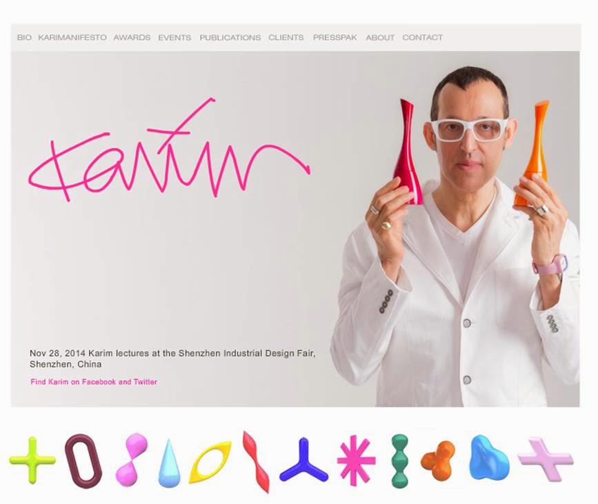
Meet Designer Karin Rashid
Karim Rashid is a modern designer who is definitely not afraid of color. He is a well-rounded designer with many talents from amazing spaces, furniture design, lighting and so much more.
Take a look
at his creations.
Color Inspiration
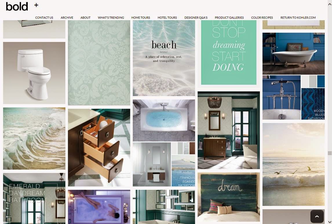
I love this web page by Kohler! Kohler has creatively created a page that
gives wonderful color inspirations, on a full spectrum for your Kitchen, Bath
and everyday life.
Take a look
and enjoy !

Primary Colors: The color wheel is based on the three primary colors Yellow, Red and Blue. These colors cannot be mixed from other pigments in order to get them.
Secondary Colors: Secondary colors are a result of taking two equal amounts of two primary colors.
Tertiary Colors: Mixing equal amounts of a primary color and a secondary color create Tertiary colors. These colors are situated on the color wheel between the two hues used to produce them. These colors are Red Orange, Yellow Orange, Yellow Green, Blue Green, Blue Violet, and Red Violet.
Analogous: Analogous is a color scheme by using one dominant color and colors adjacent to it on the color wheel. No more than half of the colors should be used in Analogous color schemes.
Complimentary: Complimentary colors schemes are formed by using two colors that are opposite from each other on the color wheel. These schemes always contain one cool color and one warm color because they are directly across from each other. When the two colors are placed next to each other they can intensify each other and create dramatic looks.
Split Complimentary: Split Complimentary is a three color scheme that has one dominant color and two hues that are next to its complimentary color. This scheme has less contrast than a Complimentary color but keeps interest.

Color is a very important element in Design. We use color to express ourselves and can create an enliven or subdued mood in a certain space. Each color we psychologically associate with a feeling and can be perceived in many ways. Some colors relax us, other energize but all have a typical association to them.
Some
Color Associations
Red: Is a warm color associated with Love,
passion, danger, fire, strength and excitement.
Yellow: Joy, sunlight, spring, sunflower,
happiness, warmth, charm, clarity and light.
Orange: Fruits, sunsets, holydays, the sun,
encouragement, comfort.
Blue: Ocean,
honesty, tranquil, masculine, sky, truth, honor, loyalty.
Green: Nature, envy,
money, life, peace, luck, healing and security.
Violet- Royalty, drama, mystery, glamour,
dignity, power, and spirituality.
White: Pure, holy, clean,
sophistication, freshness, healing, peaceful, stars and moon.
Black- Night, morning, sophistication,
mystery, power, magic, and dramatic.
COLOR SCHEMES

Primary Color Scheme
Colors: Red, Blue, Yellow

Colors: Green, Violet, Orange

Tertiery Color Scheme
Colors: Red Orange, Red Violet, Blue Violet & Pink

Analogous Color Scheme
Colors: Yellow, Yellow Green, Yellow Orange, Green

Complimentary Color Scheme
Colors: Yellow & Violet

Split Complimentary Color Scheme
Colors: Violet, Yellow Orange, Green

Achromatic Color Scheme
Using the colors White, Black and Gray variations creates an achromatic color scheme.

Monotone Color Scheme
Monotone color schemes are neutral and safe. The main colors used are colors like off-white, rich browns, off-black, beige, cream and tan.

Monochromatic Color Scheme
Monochromatic color schemes use one color hue but different degrease of intensity